Simulating the Distribution of P-Values
Simulating p-values helps in study design, significance testing, and controlling false discoveries. See how they behave in different scenarios!
Introduction
P-values are fundamental to statistical hypothesis testing, yet their behavior is often misunderstood. When the null hypothesis (\(H_0\)) is true, p-values follow a Uniform(0,1) distribution. However, when the alternative hypothesis (\(H_A\)) is true, p-values tend to cluster near zero.
Understanding these distributions is essential for designing studies, setting appropriate significance levels, and managing false discovery rates (FDR). This is possible because of this fascinating probability concept: the Probability Integral Transform / Universality of the Uniform. Please check those before exploring this
In this blog, we explore:
-
Case 1: When the null and observed distributions are identical (\(H_0\) is true).
-
Case 2: When the observed distribution differs from the null (indicating a real effect).
We will simulate and visualize p-values in these scenarios to gain intuition into how hypothesis tests behave.
Step 1: Defining the Distributions
We define our null distribution (which represents data under \(H_0\)) and two Sample distributions:
- One that is identical to the null (no real effect).
- One that is shifted (indicating a true effect).
import pymc as pm
import numpy as np
import scipy.stats as stats
import matplotlib.pyplot as plt
import seaborn as sns
import pytensor.tensor as pt
import pytensor

null_dist = pm.Normal.dist(0,4)
sampling_dist = pm.Normal.dist(0,4) # when Null represents true sampling distributions
sampling_dist2 = pm.Normal.dist(5,4) # when Null represents differs from sampling distributions
Step 2: Computing the Probability Density Functions (PDFs)
To visualize the distributions, we compute their PDFs using PyTensor:
value=pt.scalar()
null_pdf = pm.logp(null_dist,value).exp()
sampling_pdf = pm.logp(sampling_dist,value).exp()
sampling2_pdf = pm.logp(sampling_dist2,value).exp()
## lets create a function to get the null_pdf
get_null_pdf = pytensor.function([value],[null_pdf])
get_sampling_pdf = pytensor.function([value],[sampling_pdf])
get_sampling2_pdf = pytensor.function([value],[sampling2_pdf])


fig,axs = plt.subplots(1,2,figsize=(10,5))
eXs = np.linspace(-20,20,1000)
eY_null = np.array([get_null_pdf(eX) for eX in eXs]).squeeze()
eY_sampling = np.array([get_sampling_pdf(eX) for eX in eXs]).squeeze()
eY_sampling2 = np.array([get_sampling2_pdf(eX) for eX in eXs]).squeeze()

# Plot both PDFs with transparency and different styles
axs[0].plot(eXs, eY_null, label="Null Distribution", color="royalblue", linestyle="solid", alpha=0.3,lw=5)
axs[0].plot(eXs, eY_sampling, label="Sampling Distribution", color="green", linestyle="dashed", alpha=0.7,lw=1)


# Increase tick label size
axs[0].tick_params(axis='both', labelsize=12)

# Add grid lines for better readability
axs[0].grid(True, linestyle="--", alpha=0.5)

# Add labels with a slight size boost
axs[0].set_xlabel("X-axis", fontsize=14)
axs[0].set_ylabel("Density", fontsize=14)

# Title for clarity
axs[0].set_title("Null distribution overlaps Sampling Distribution \n(case 1)", fontsize=10, fontweight='bold')


# Plot both PDFs with transparency and different styles
axs[1].plot(eXs, eY_null, label="Null Distribution", color="royalblue", linestyle="solid", alpha=0.5,lw=5)
axs[1].plot(eXs, eY_sampling2, label="Sampling Distribution", color="green", linestyle="dashed", alpha=0.7,lw=1)

# Fill the area under each curve to improve visibility
# axs.fill_between(eXs, eY_null, alpha=0.2, color="blue")
# axs.fill_between(eXs, eY_sampling, alpha=0.2, color="red")

# Adjust legend font size and move it to the upper right
plt.legend(fontsize=12, loc="lower center", frameon=True)

# Increase tick label size
axs[1].tick_params(axis='both', labelsize=12)

# Add grid lines for better readability
axs[1].grid(True, linestyle="--", alpha=0.5)

# Add labels with a slight size boost
axs[1].set_xlabel("X-axis", fontsize=14)
axs[1].set_ylabel("Density", fontsize=14)

# Title for clarity
axs[1].set_title("Null distribution difffers Sampling Distribution \n(case 2)", fontsize=10, fontweight='bold')
axs[0].legend(fontsize=12, loc="lower center", frameon=True)
plt.show()

# plt.legend()
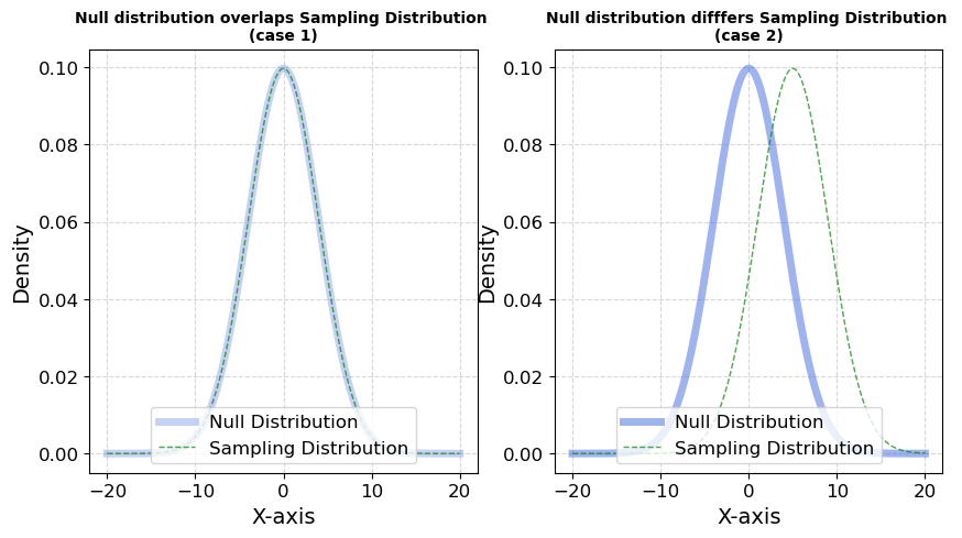
Fig 1.1; Comparision of Cases
Step 3: Visualizing the Distributions
We now plot the Null and Sample distributions for both cases.
pval=1-(pm.logcdf(null_dist,sampling_dist).exp())
get_pval =pytensor.function([sampling_dist],[pval])

pval2=1-(pm.logcdf(null_dist,sampling_dist2).exp())
get_pval2 =pytensor.function([sampling_dist2],[pval2])
obs1=pm.draw(sampling_dist,200)
obs2=pm.draw(sampling_dist2,200)
fig,axs =plt.subplots(figsize=(10,5))
eX =np.linspace(np.min([obs1,obs2]),np.max([obs1,obs2]),500)
eY = [get_pval(x) for x in eX]
eY2 = [get_pval2(x) for x in eX]
# eY2= [pval_eval(x) for ]
axs.plot(eX,eY,lw=5,color="k",alpha=0.7,label="Survival function")
# axs.plot(eX,eY2,color="k")
axs.scatter(obs1,np.zeros(200),label = "samples for case 1",alpha = 0.3)
axs.scatter(obs2,np.zeros(200)+0.1,color="green",label = "samples for case 2",alpha=0.3)
axs.set_title("Survival Function to calculate p-values \n One sided test",fontsize=10, fontweight='bold')
plt.legend()
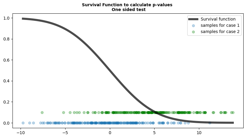
Fig 1.2; Function that maps values to p-values
Here, we will use survival function to compute p-values for a one-sided test. It visualizes two sets of samples:
-
Blue dots represent samples from Case 1, where the sampling distribution follows the null hypothesis (i.e., no real effect).
-
Green dots represent samples from Case 2, where the sampling distribution deviates from the null hypothesis (i.e., there is an effect).
-
The black curve is the survival function, mapping observed test statistics to p-values.
Key Observations:
Under the null hypothesis (Case 1 - Blue dots):
- The samples appear more uniformly spread along the function.
- This suggests that, when the null is true, test statistics will be evenly distributed.
Under the alternative hypothesis (Case 2 - Green dots):
- The samples are skewed toward the right along the function.
- This hints at how test statistics behave when there is an effect, potentially leading to smaller p-values.
This plot serves as an initial hint about how p-values behave under different conditions. A more detailed visualization will provide a clearer picture of their distribution which we will do next
pvals=pm.draw(pval,100000)
pvals2 = pm.draw(pval2,100000)
fig,axs =plt.subplots(1,2,figsize=(12,4))
sns.histplot(x=pvals, bins=50, stat='density', color='royalblue', edgecolor='black', ax=axs[0])
sns.histplot(x=pvals2, bins=50, stat='density', color='green', edgecolor='black', ax=axs[1])
axs[0].set(
    xlabel='Values',
    ylabel='Density',
    # yticks=np.arange(0, 1.2, 0.1),
    yticks=[0, 0.5, 1],
    # ylim=(0, 2),
    ylim=(0, 1.5)
)
axs[0].set_title(label='Distribution of p-values \n case1',fontsize=10, fontweight='bold')
axs[0].axvline(x=0.05, color='red', linestyle='--',label="alpha at 0.05")
axs[1].set(
    xlabel='Values',
    ylabel='Density',
    xticks=np.arange(0, 1.2, 0.1),
    # xticks=[0, 0.5, 1],
    # ylim=(0, 2),
    xlim=(0, 1)
)
axs[1].set_title(label='Distribution of p-values  \n case2',fontsize=10, fontweight='bold')
axs[1].axvline(x=0.05, color='red', linestyle='--',label="alpha at 0.05")
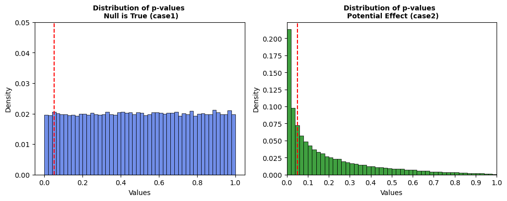
Fig 1.3; Distribution of P-values
Key Takeaways:
-
Case 1: When the null is true, p-values follow a Uniform(0,1) distribution. Around 5% of studies are rejected purely by chance at \(α = 0.05\).
-
Case 2: When the null is false, p-values cluster near zero, increasing the rejection rate significantly (~35%).
Conclusion
Simulating p-values provides valuable insights into statistical testing. By comparing cases where \(H_0\) is true vs. \(H_A\) is true, we can:
✅ Verify test calibration.
✅ Understand when and why \(H_0\) is rejected.
✅ Design more effective studies.